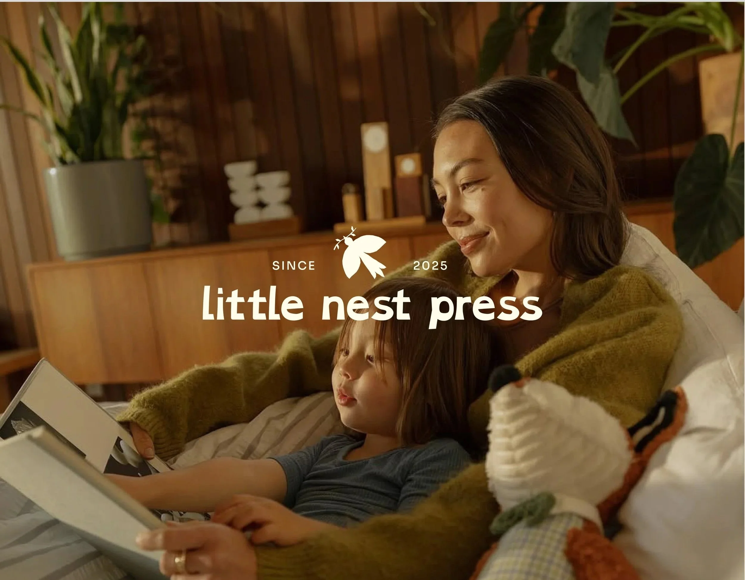
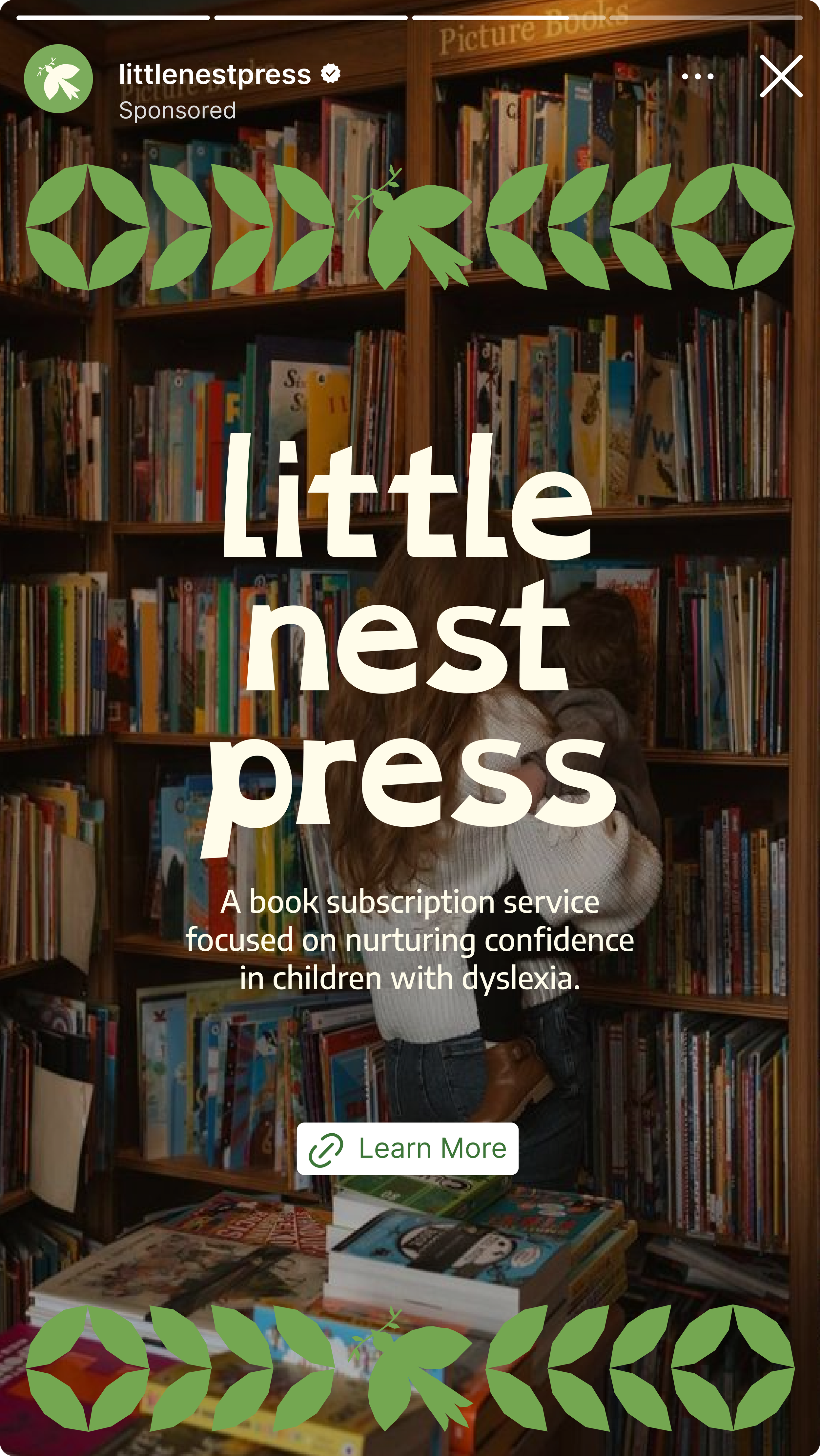
SUBSCRIPTION SERVICE BRAND AND PACKAGE DESIGN Little Nest Press
Giving them the wings to soar.
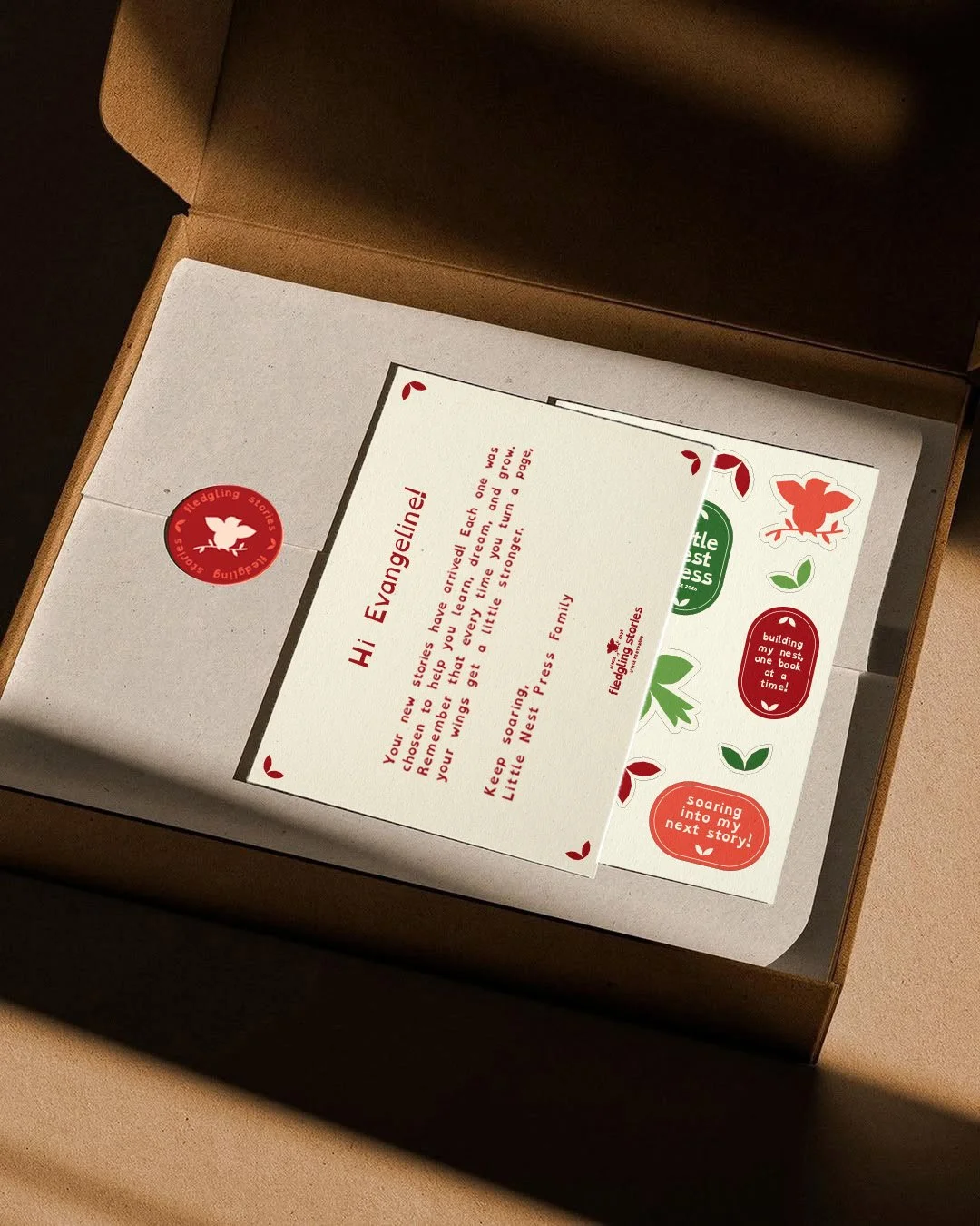
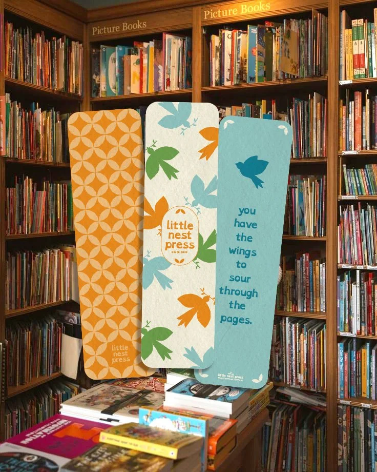
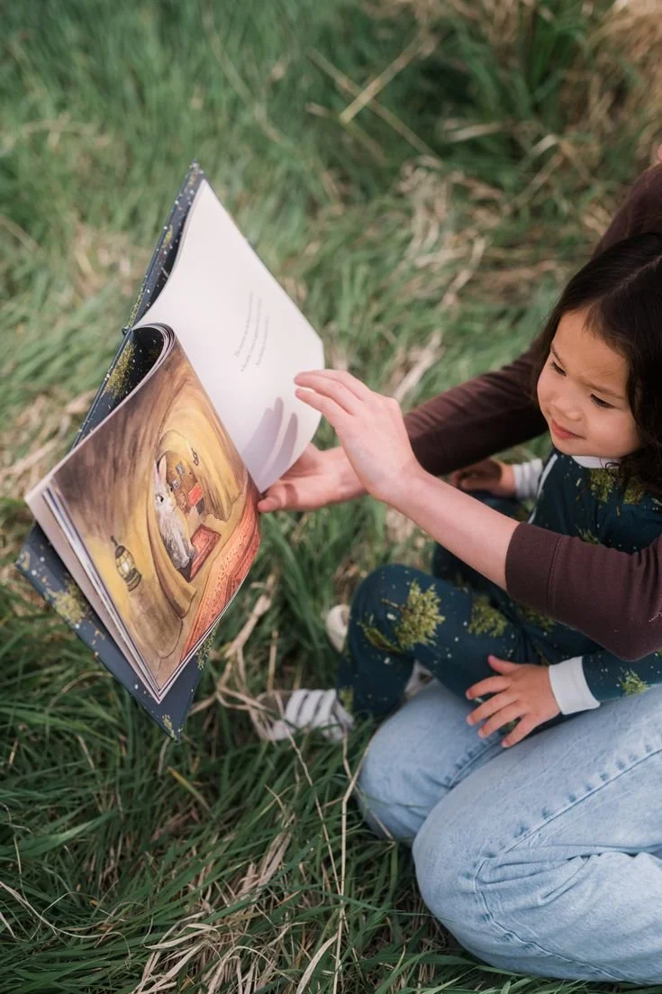
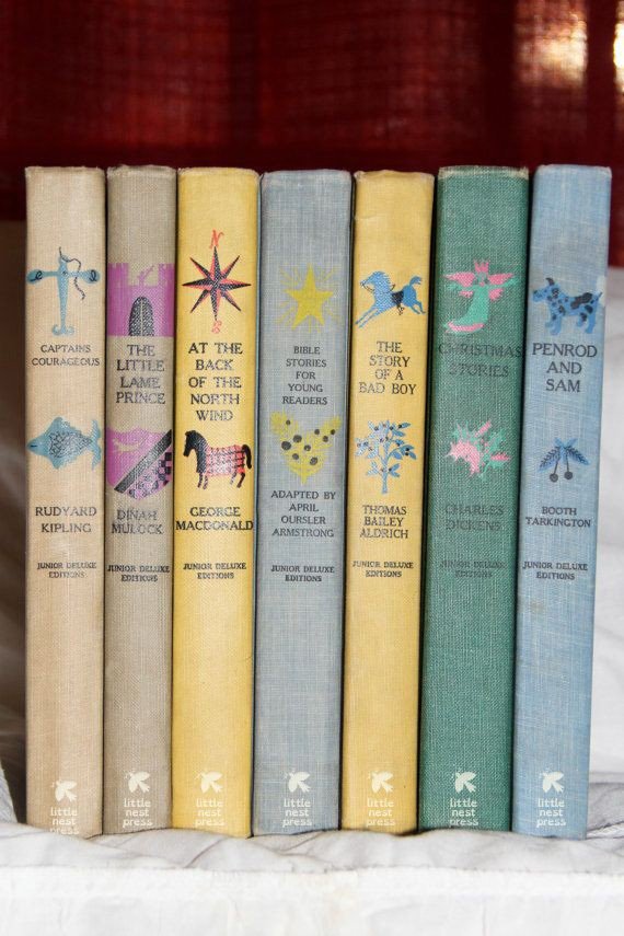
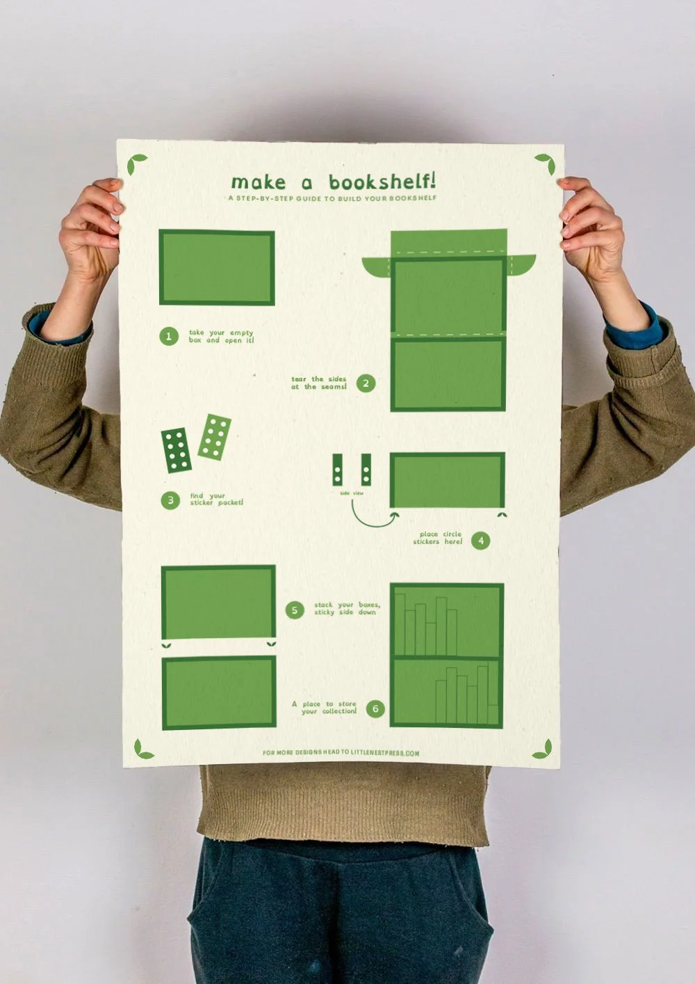
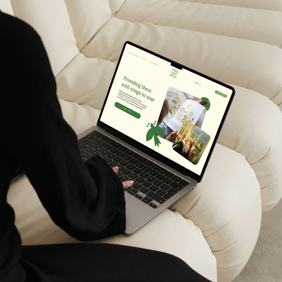
Little Nest Press is a sustainable children’s book subscription that supports readers with learning differences. It delivers curated books through an engaging online experience, offering customizable subscriptions that grow with each child while minimizing clutter through reusable and returnable packaging.
PROJECT TYPE
Subscription Service, Brand Story, Brand Identity, Package Design
ROLE
Research, Brand Design, Visual Design, Package Design
TOOLS
Adobe Illustrator, Adobe Photoshop, Figma
DELIVERABLES
Brand Story, Brand Identity, Mockups, Final Presentation
THIS WAS MADE FOR EDUCATIONAL PURPOSES

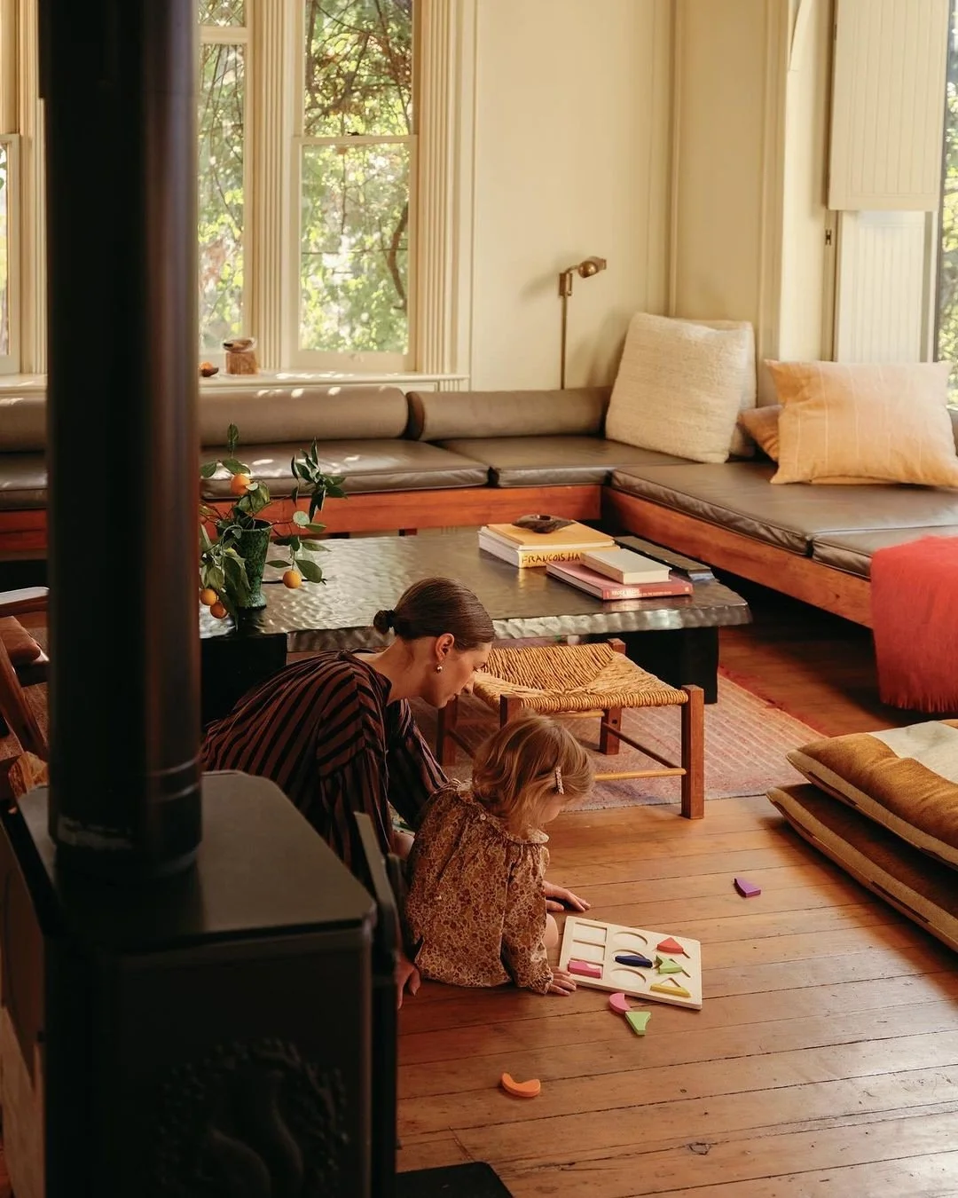
Little Nest Press cultivates a love of reading in children with reading differences.
Amanda, a mother of three in suburban Boston, grew up loving reading and wanted to pass that passion on to her children. With busy schedules and limited access to libraries, she sought a way to bring books home in a way that fit her family’s needs. When her daughter Amelia was diagnosed with dyslexia, Amanda recognized the need for a flexible, tailored reading solution that could support all of her children, regardless of ability or space constraints.


PROBLEM
Many children with learning differences, such as dyslexia, face barriers to accessing books that match their abilities and interests. Busy family schedules and limited space make frequent library visits difficult, while existing subscription services often fail to provide customizable, accessible, and engaging reading experiences. The challenge was to design a sustainable book subscription that grows with each child, supports diverse learning needs, and delivers a thoughtful, clutter-free experience for both children and parents.
SOLUTION
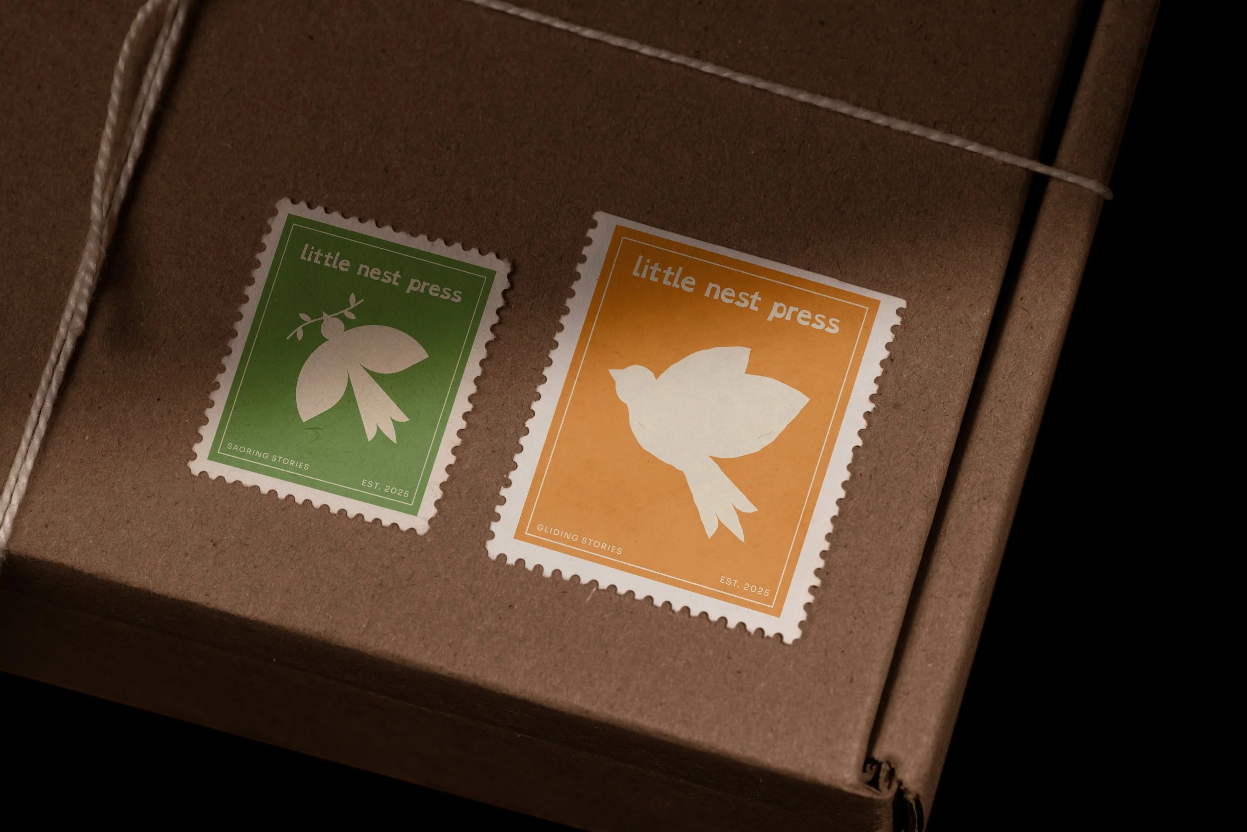
Little Nest Press was created to make reading accessible, joyful, and personal for every child. Designed for families navigating different reading abilities, it delivers a thoughtfully curated library that grows with each child. Rooted in warmth and inclusivity, the subscription supports children with learning differences, including dyslexia, through flexible schedules and tailored selections. With sustainability at its core, reusable packaging and simple systems make every interaction meaningful, fostering imagination, confidence, and a lifelong love of reading.

OUTCOMES + TAKEAWAYS
This project strengthened my ability to design with empathy, tailoring even the smallest brand details to the needs of the user. I learned how accessibility-driven features, such as a website toggle that switches between a serif and dyslexia-friendly typeface, can meaningfully improve the user experience. Designing every touchpoint, from ordering online to opening the box, challenged me to think holistically and solve a range of design problems with intention.